
Fauvism
What I was trying to do with this piece was made a famous Van Gogh painting into Fauvism. I wanted to use the different rectangles to make this painting look as much like the painting as I could. The tools I used were the rectangle tool and the fill tool. The Fauvism element can be seen throughout the piece with all the different rectangles. What I would do differently would maybe take more time on details with the cigarette.

Logos with initials
What I was trying to do with this piece was make my initials into diverse artistic logos within the perimeters given. The tools I used were mostly text tools and adjust tools. The diverse elements can be seen in the various logo choices. What I would do differently would be using a better set of fonts.

Warhol
What I was trying to do with this piece was make edgy Warhol portraits. The tools I used were select tools and filters. The Warhol element can be seen in the complimentary colors used in the different corners of the picture. What I would do differently would be using darker colors to give it that edgy look.

World in a bottle
What I was trying to do with this piece was make a futuristic type of plant in a bottle inspired by WALL-E. The tools I used were selection tools, eraser and some transforming tools.

World in a bottle
What I was trying to do with this piece was make a surrealistic world in a mason jar. I wanted to change the colors to make it look more romantic and soft like this world is perfect. The tools I used were selection tools, eraser tools, and color saturation. The surrealist world element can be seen in the ocean with an astronaut. What I would do differently would be blending the water more so it looked more natural with the background and the other water.

Fary tail
What I was trying to do with this piece was made a world inspired by Where The Wild Things Are. The tools I used were different selection tools, erasers, and color saturation tools. What I would do differently would be making the different pictures look more realistic and blend them into the background and the surrounding objects.

Cubism self portrait
What I was trying to do with this piece was make a romantic mood in my self portrait. This was done by the different colors I used like the pinks and purples. The tools I used were the rectangles and color saturation and different filters. The cubism element can be seen in the cubes used to distort my face. What I would do differently would be making things a little more saturated maybe.
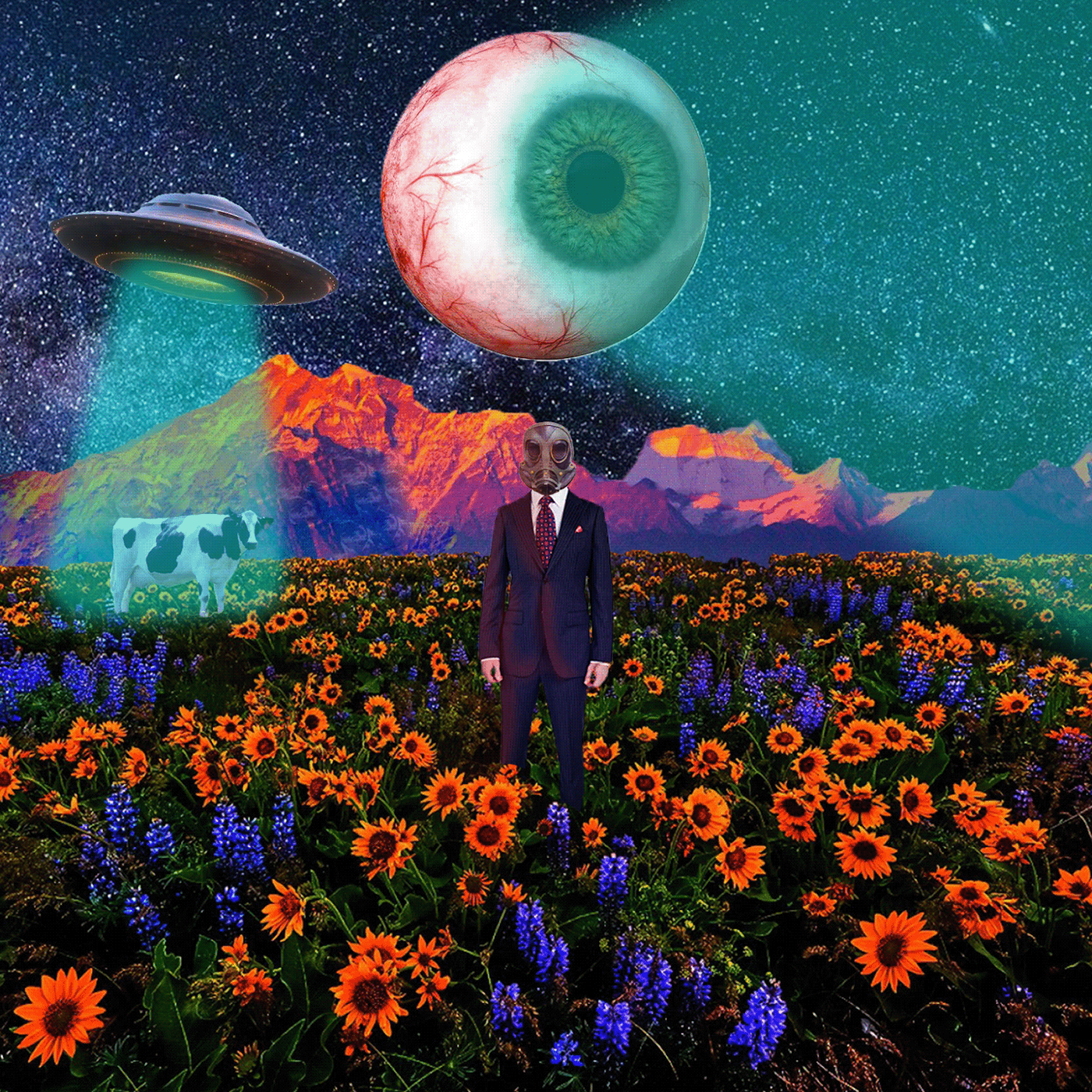
Surrealism
What I was trying to do with this piece was make something that doesn't make any sense and is also a little unsettling. I wanted to make a person in a beautiful place with a gas mask so it would look like a futuristic world in a way. The tools I used were selection tools, filters, erasers, and paint tools with opacity. The surrealism element can be seen in the aliens and the different colors not matching and just kind of all through this picture. What I would do differently would be maybe not add the beams the way I did.
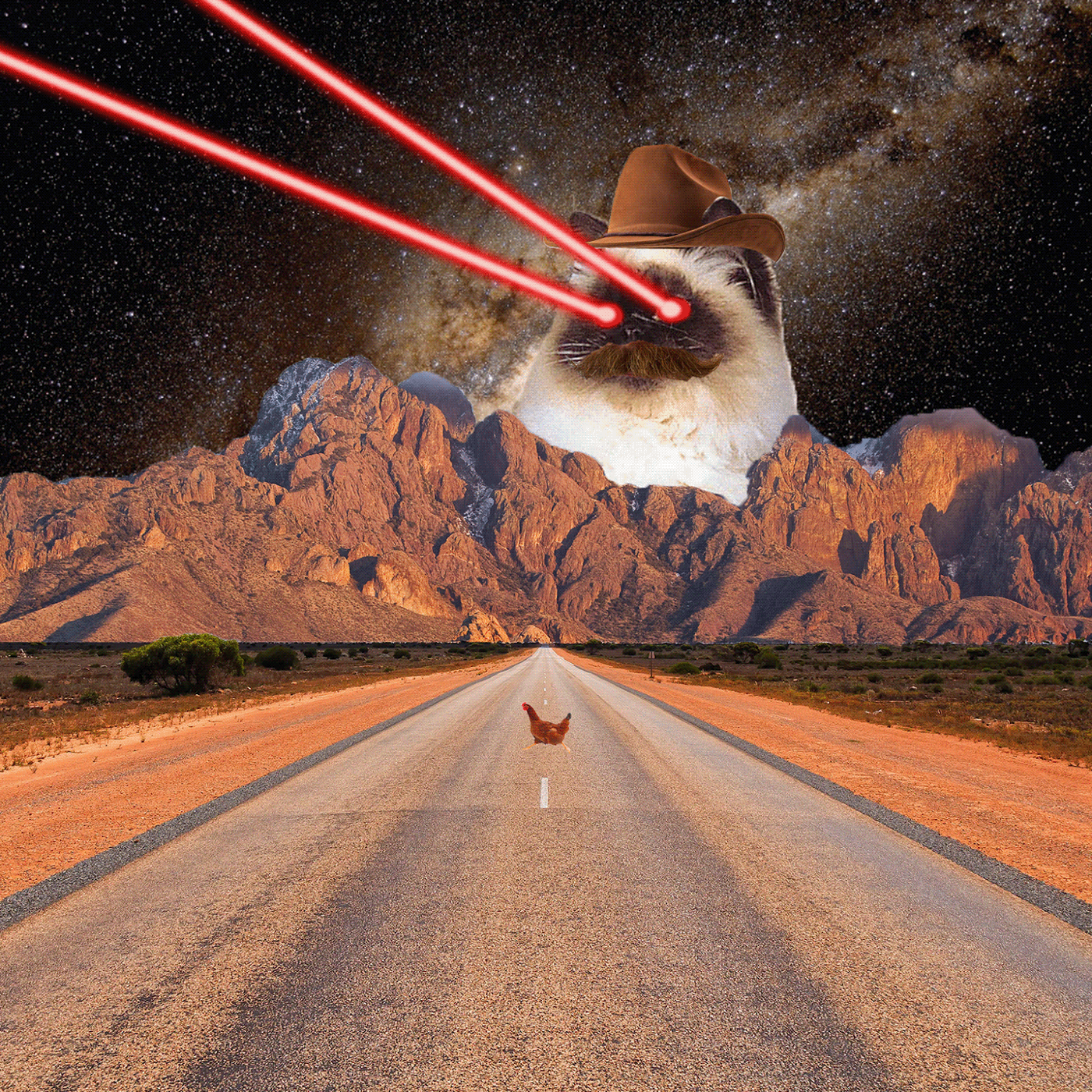
Surrealism
What I was trying to do with this piece was make an atrocity. The tools I used were selection tools, eraser tools, and paint tools. The only thing I would change is making things look more blended but I love this weird Sweet Home Alabama mustache cat.

Pop art
What I was trying to do with this piece was make pop art out of the beautiful piece of work that is my friend's artwork on my face. I wanted to make it edgy with a bit of teen drama. The tools I used were lots of filters. The Pop art element can be seen in the filters and very saturated picture. What I would do differently would make this less saturated.

Poster (propoganda poster)
What I was trying to do with this piece was make a feminist poster. I wanted to use A.O.C because she is a feminist queen. The tools I used were mostly filters and text tools. What I would do differently would be using a different font and not as bold filters.

Poster
What I was trying to do with this piece was make a poster inspired by interior design. I wanted to make it look more modern and I don't know why I used prime colors. The tools I used were text and shape tools. What I would do differently would be using different colors.

Tri-Fold
What I was trying to do with this piece was put the text and pictures I was given in a nice eye-catching and appealing design. I wanted to make the Tri-Fold look very professional. The tools I used were transformation tools and different font tools. What I would do differently would maybe be using a different font I'm not sure.
Newsletter
What I was trying to do with this piece was put the text and pictures I was given in a nice eye-catching and appealing design and make something that looked classy and important. I wanted to make the newsletter look very professional. The tools I used were fitting tools and different font tools. What I would do differently would be putting more pictures in.

Mock up
The idea for this project was inspired by the bible. Im not a religious person but the story of religion is interesting. I liked the apple being used as a metaphor for temptations like sex. I put two nude women on the sides of the apple to make that metaphor come to life. I liked the look of the apple being red and everything else being black and white because it made the eye drawn to it. I did this because people don't see the metaphor of the apple at first. They have to look into the meaning to understand. You just see an apple at first and then when you look closer you see nude women and trees from the garden of Eden and the snake that is used as a metaphor for something sneaky or dark. I wanted to add that moody theme as well. Thats what I also tried to do with the ad and banner.

Print AD
For the print ad I tried to make the ad seem moody to match the soda. I thought that this person holding the drink had a moody yet romantic and dark energy to it. I liked the grain in the back as well to make the soda can pop out more to the viewer.

Social Post
I didn't have a lot of time to complete this so I just added a snake and crosses to my print ad. When you look closer the crosses turned into reverse crucifixes being a metaphor for the evil that is felt when thinking about the snake. Snakes ended up being a very big part in my whole plan because I wanted that moody feeling to be a pattern within this. I wanted to make the snakes represent the dark side of the apple.

Banner
What I did with this was try to make the soda can very prominent. I made the background black to keep it dark and then I made the snake almost a second thought because as Ive mentioned, the snake represents the darker side of the apple and the temptations within the apple.
